

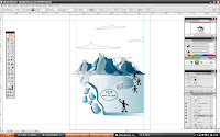
first of all, i added a template which is my sketch into the illustrator file. i start everything with tracing the mountains using the pen tool. well i didnt copy it exactly but i changed it a little bit.


after that, i copied my original design for the mountains from assignment 2 into this. i duplicated them but change its sizes accordingly. what happens to the mountain layer? i changed its transperancy to multiply and hence, result in what you see now. it blends pretty well with the other mountains. and then i duplicated the mountain layers and reflected it horizontally and lower its opacity. so that it looks more like a reflection. i also used envelop disort > reset warp > wave. this results in the wave like mountain reflection that you see.
step7.
after all that, i started colouring my ice bergs and igloo. and as usual, i used different shades of blue by the gradient tool for all of these.
step8.
here, i colour the sky with dark shades of blue using the gradient tool. i also change its transparency to multiply for the later effects once im done with the sky.
step9.
next, i colour the conversation bubble with blue colour. and change its transparency to hard light. after that i write my tagline/slogan which is "Keep the ice cool!stop them from melting." i used this font because it looks kind of exotic. i also change the colour of some parts of the wordings. besides that, i also applied outlines to the text. and i made the alphabet "O" more spiky/poky.
step10.
now, i start colouring the sky. i used the gradient tool for this. and used the shades of blue with orange. orange actually represents the hot weather caused by global warming that is effecting the polar ice caps. and why they are melting. i changed its transparency to multiply and to a lower opacity. this way it blends well with the mountains and clouds. (:

step11.

No comments:
Post a Comment